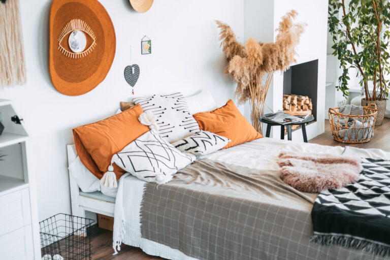
Okay, so here’s the thing – I used to think picking bedroom colors was just about finding something pretty. Boy, was I wrong! After repainting my bedroom three times in one year (yes, really), I finally cracked the code on what makes certain color combinations actually work.
You know that feeling when you walk into someone’s bedroom and it just feels… right? Like you could immediately take a nap there or wake up feeling amazing? That’s not an accident. It took me way too long to realize that the secret sauce isn’t just in picking nice colors – it’s about finding combinations that play off each other in ways that make your brain go “ahhhh, yes.”
So I’m sharing what I’ve learned through trial, error, and probably too many late-night Pinterest sessions. These aren’t just pretty combinations – they’re the ones that actually changed how my space felt.
The Blue and Grey Combo That Made Me a Morning Person
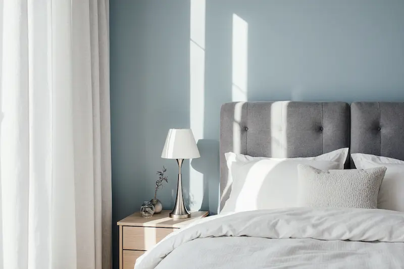
I know, I know – claiming paint colors made me a morning person sounds ridiculous. But hear me out. When I painted my bedroom in soft blues and greys, something shifted. The blue reminded me of those perfect early morning skies, while the grey kept things grounded and sophisticated.
What really surprised me was how this combination worked differently throughout the day. Morning light made the blue pop and energized me, while evening light brought out the calming grey tones. It’s like having two bedrooms in one! My friend Jake saw it and immediately asked for the paint codes – that’s when I knew I was onto something.
Pink and Gold: The Combination I Was Too Scared to Try (Until I Did)
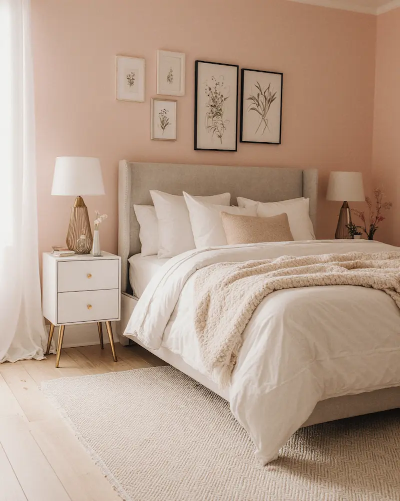
I’ll be honest – I spent months convincing myself that pink and gold would be “too much” for my bedroom. Then my sister painted her guest room this way, and I practically moved in. There’s something about how the softness of pink meets the warmth of gold that creates this cocoon of luxury.
The trick I discovered? You don’t need to go full-on princess castle. I started with blush pink walls and added gold through picture frames, lamp bases, and drawer pulls. Even my boyfriend, who claims he “doesn’t do pink,” admitted it made the room feel expensive. Score!
Peach and White: My Happy Accident Discovery
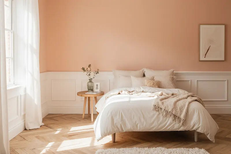
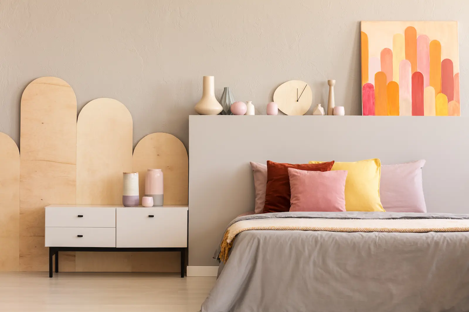
This combination happened by accident when I bought the wrong shade of “nude” paint. Instead of beige, I got this gorgeous peachy tone. I almost returned it, but then I held it up against my white trim and… magic.
Here’s what nobody tells you about peach – it’s like having permanent golden hour in your bedroom. The white keeps it from feeling too warm or closed in. Every morning feels like waking up inside a sunrise. My mom visited and immediately asked if I’d installed special lighting. Nope, just really good color choices!
Light Brown and Green: Bringing the Forest Inside
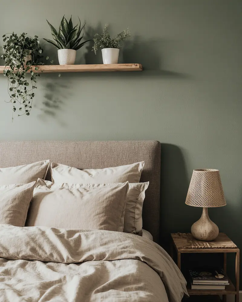
I went through this phase where I wanted my bedroom to feel like a treehouse (don’t judge). Light brown and sage green turned out to be exactly what I needed. It’s earthy without being dark, natural without looking like camouflage.
The unexpected bonus? This combination made all my plants look amazing. Suddenly my sad little pothos looked like it belonged in a magazine. Plus, something about these colors together just makes you breathe deeper. It’s like forest bathing, but in your pajamas.
Orange and White: The Energy Boost I Didn’t Know I Needed
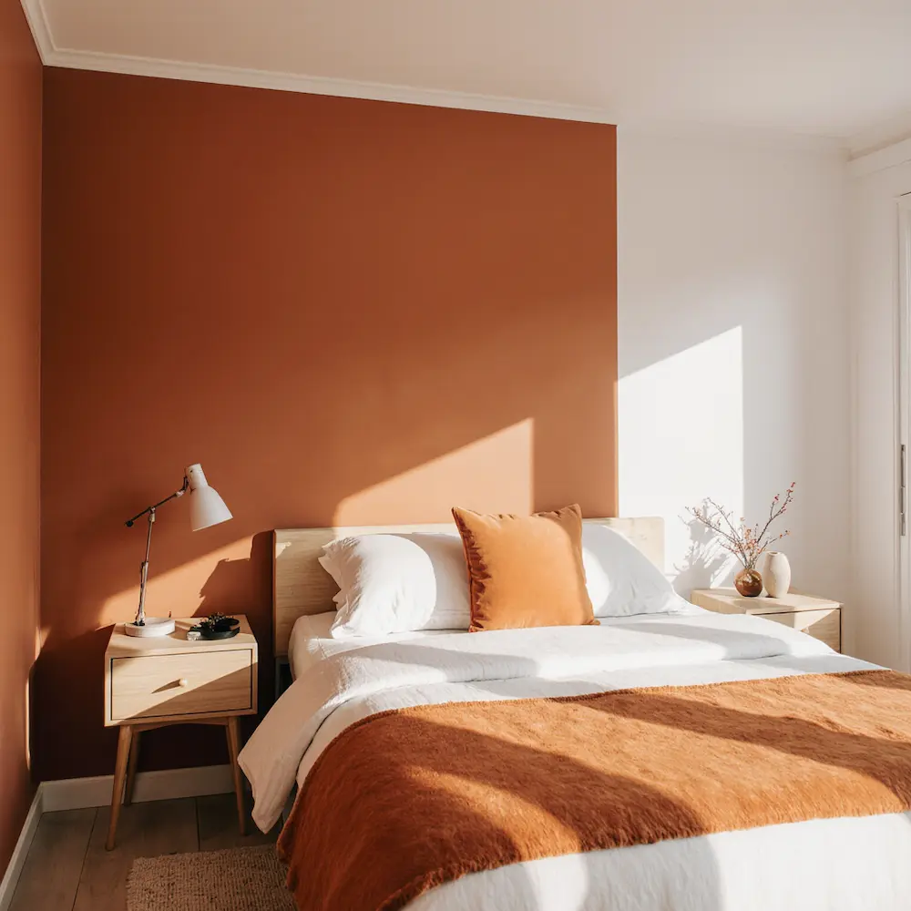
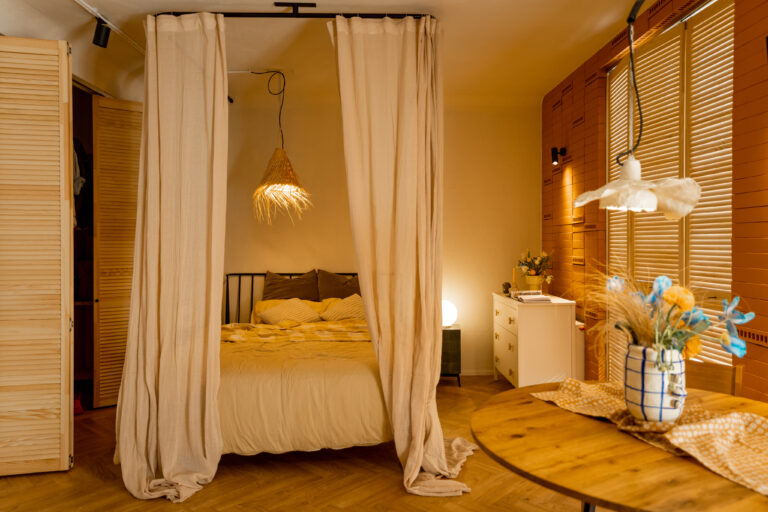
When I told people I was considering orange for my bedroom, they looked at me like I’d lost my mind. “Isn’t that too energizing for sleep?” they asked. But here’s the secret – it’s all about the shade. I went with a burnt orange that’s more sunset than traffic cone, paired with crisp white.
The result? A room that wakes me up gently in the morning but still feels cozy at night. It’s like having a permanent vitamin D boost. My energy levels actually improved after this change – though that might also be because I finally started making my bed to show off the colors!
Pale Blue and White: The Combination That Fixed My Insomnia
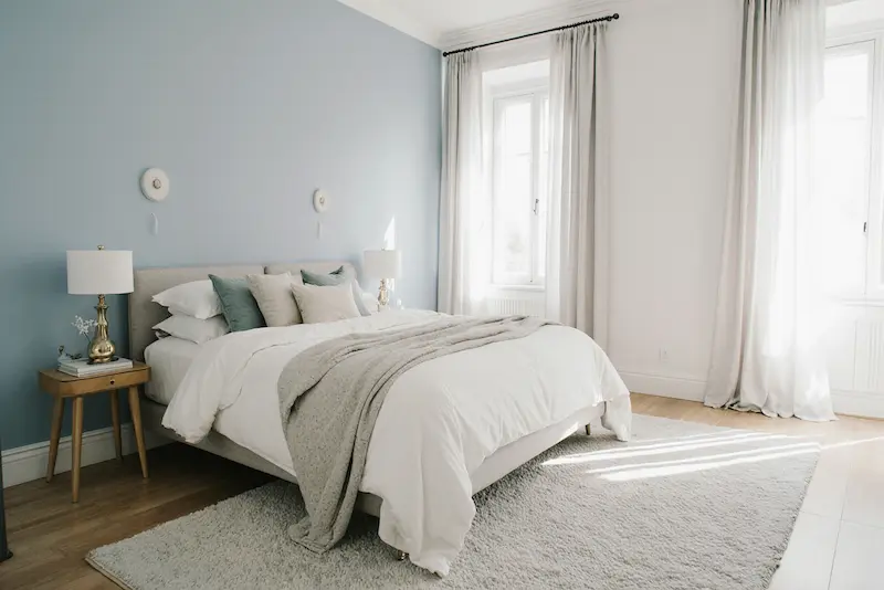
Okay, maybe “fixed” is a strong word, but this color combo definitely helped. I painted opposite walls in the palest blue I could find, leaving the others white. It created this wrapped-in-clouds feeling that my anxious brain apparently needed.
What I didn’t expect was how this combination would make my tiny bedroom feel twice as big. The colors flow into each other so seamlessly that your eye just glides around the room. Even my cat seems calmer in there now (though that might be unrelated).
Brown and Cream: The “Boring” Choice That Wasn’t
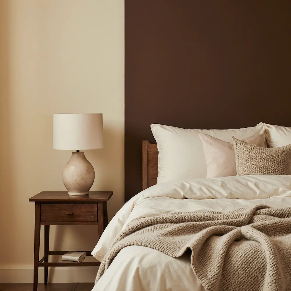
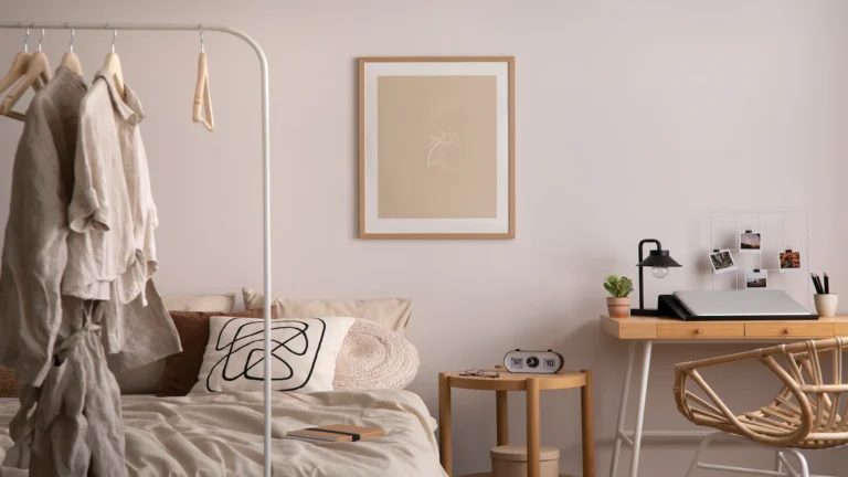
I fought against brown and cream for years because it felt too safe, too predictable. Then I stayed in this gorgeous Airbnb that changed my mind completely. The host had used rich chocolate brown with warm cream, and it felt like being wrapped in the world’s coziest blanket.
When I tried it myself, I discovered the secret – it’s all about the undertones. Cool browns look modern, warm browns feel vintage. I went warm and added cream with yellow undertones. Now my bedroom feels like that perfect cup of coffee on a Sunday morning.
Red and White: My Bold Phase That Actually Worked
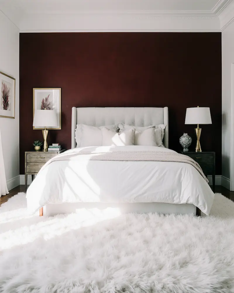
During what I call my “confident era,” I decided to try red and white. Not fire-engine red – more like a deep, romantic burgundy-red. Everyone said I’d regret it. Everyone was wrong.
The key was balance. I did one accent wall in red behind my bed, keeping everything else white. It added drama without overwhelming the space. Plus, it made my room feel intentional and designed, not just thrown together. My dating life may or may not have improved after this change (correlation, not causation, but still…).
Lavender and Off-White: The Stress-Relief Combo
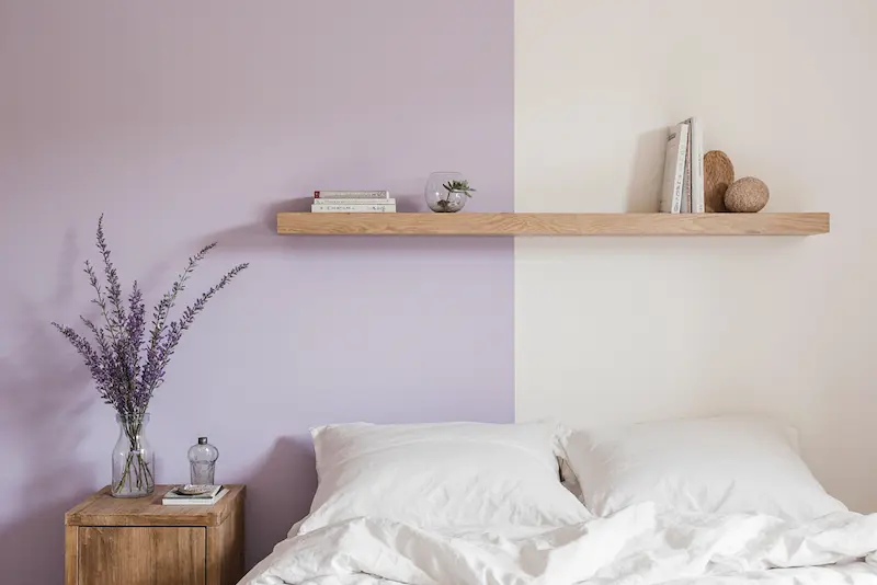
After a particularly rough year, I needed my bedroom to be a sanctuary. Enter lavender and off-white. I’d always associated lavender with grandma’s house, but the right shade changed everything. Think less potpourri, more morning mist.
The off-white (which is warmer than pure white) made the lavender feel sophisticated rather than sweet. Friends started commenting that my room felt like a spa. I even started sleeping better – though that might be because I finally felt like I had a real retreat to escape to.
Mint Green and White: The Fresh Start I Needed
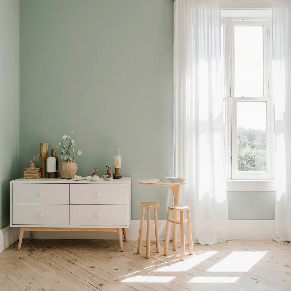
Post-breakup bedroom makeover? Check. I chose mint green and white because I wanted everything to feel fresh and new. What I got was even better – a room that felt like spring every single day.
The mint is subtle enough that it doesn’t scream “green!” but adds just enough color to feel special. White keeps it from feeling too themed. Best part? This combo goes with literally everything. All my mismatched furniture suddenly looked intentional.
Black and Grey: My Moody Phase That Stuck
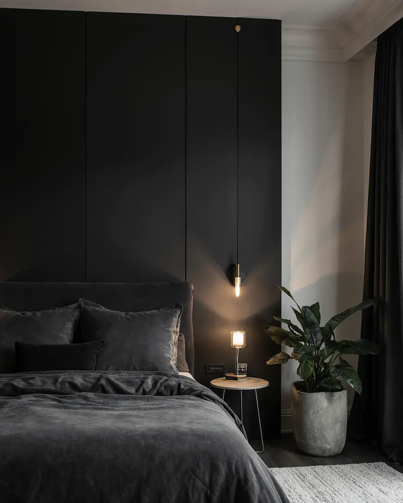
I went through a minimalist phase and painted my bedroom black and grey. My friends thought I’d gone goth. But here’s what they didn’t see coming – it’s actually incredibly soothing. The black creates this cocoon effect, while grey softens any harshness.
The trick is using the right finish. Matte black walls are chef’s kiss – they absorb light in this velvety way that makes everything feel expensive. Add grey bedding and suddenly you’re living in a boutique hotel. Just make sure you have good lighting, or yes, it will feel like a cave.
Indigo and White: The Combo That Made Me Feel Like an Adult
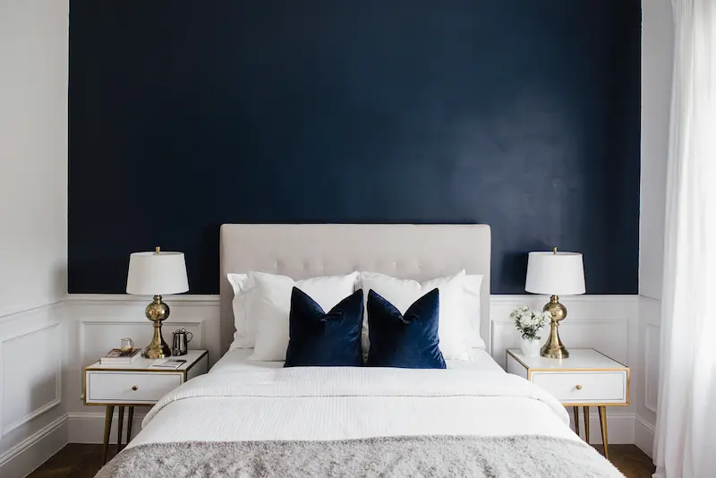
Something about indigo and white just screams “I have my life together.” It’s sophisticated without trying too hard. The deep blue-purple of indigo paired with clean white created this perfect balance of cozy and fresh.
What surprised me most was how this combination made all my random bedroom furniture look intentional. That inherited dresser? Suddenly it looked vintage-chic against the indigo. The cheap white shelves? They popped beautifully. It’s like the colors did all the decorating work for me.
Grey and Teal: The Jewel Tone That Changed Everything
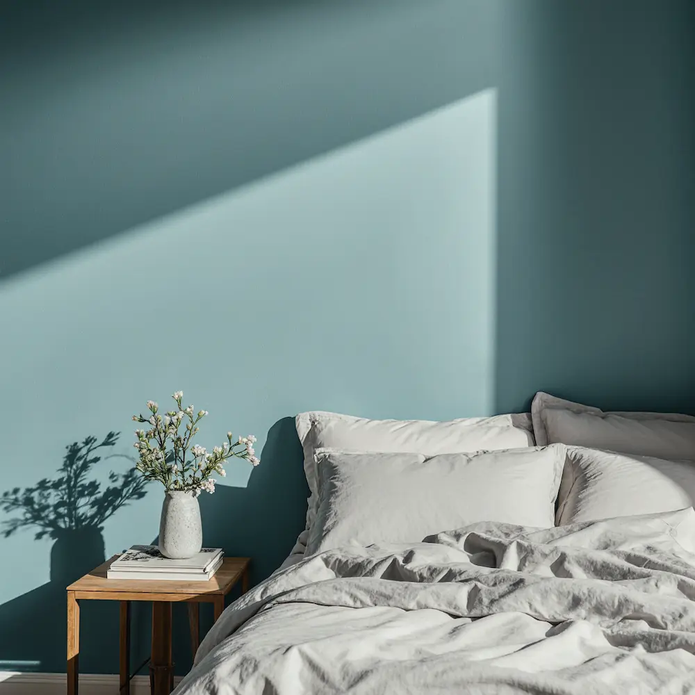
I was scared of teal for the longest time. It felt too bold, too specific. Then I saw it paired with grey and everything clicked. The grey grounds the teal, while the teal prevents the grey from feeling boring. It’s sophisticated but still has personality.
The magic happened when I realized teal changes throughout the day – sometimes it looks more green, sometimes more blue. With grey as the backdrop, it’s like having an ever-changing piece of art on your walls. Plus, it makes my eyes look amazing in my bedroom mirror (important for those morning pep talks).
Burgundy and Beige: The Surprise Winner
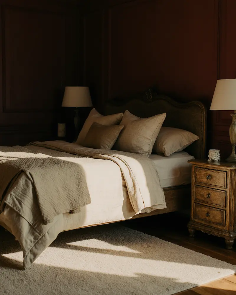
This was my “safe” choice that turned out to be anything but boring. Burgundy and beige together create this old-world elegance that made me feel like I was sleeping in a wine cellar (in the best way). It’s warm, enveloping, and somehow both energizing and calming.
I discovered that burgundy is way more versatile than pure red – it goes with everything and adds richness without screaming for attention. The beige keeps it from feeling too heavy. Now when people see my bedroom, they always comment on how expensive it looks. Little do they know it’s just good color matching!
The Game-Changer Nobody Talks About
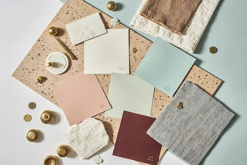
Here’s what I wish someone had told me earlier – the right color combination can literally change how you feel about your space. I went from avoiding my bedroom to wanting to spend all day there. The colors you wake up to and fall asleep with matter more than you think.
My biggest tip? Don’t overthink it. Pick combinations that make YOU feel good, not what’s trending on social media. And remember – it’s just paint. If you hate it, you can always change it. Though if you pick from these combinations, I’m betting you won’t want to.
So which combination is calling your name? I’d love to hear what you choose and how it transforms your space. Because trust me, once you find your perfect bedroom color match, you’ll wonder how you ever lived with boring beige walls!
