You know what nobody tells you about kitchen renovations? Everyone obsesses over the cabinets and countertops, but then they slap some generic beige on the walls and call it a day. I used to be that person – spent three months agonizing over cabinet hardware and then picked “Agreeable Gray” because, well, it was agreeable.
Here’s what I wish someone had told me earlier: your kitchen walls are doing way more heavy lifting than you think. They’re literally surrounding everything else you’ve carefully chosen. So after helping my sister, two friends, and going through my own kitchen disaster-turned-success, I’ve learned which wall colors actually transform a space instead of just… existing.
The Colors That Changed Everything
Deep Wine Red (Or Whatever You Want to Call Burgundy)
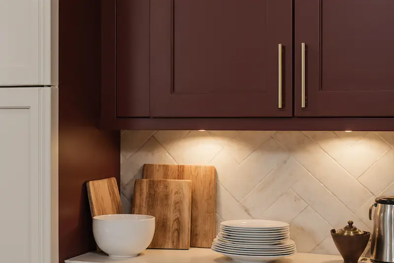
I’ll be honest – when my friend Maya suggested painting her kitchen walls this gorgeous deep red, I thought she’d lost her mind. “It’s going to look like a vampire’s lair,” I told her. Fast forward six months, and her kitchen is the most inviting space I’ve ever been in.
There’s something about that rich, wine-inspired color that makes everything feel intentional and cozy. Maya paired it with cream cabinets and brass fixtures, and suddenly her kitchen went from “meh” to “magazine-worthy.” The crazy part? It doesn’t feel dark or overwhelming like I expected. Instead, it creates this warm backdrop that makes her white dishes pop and her wooden cutting boards look like art pieces.
What I’ve learned is that deeper colors actually make small kitchens feel more intimate rather than smaller. Who knew?
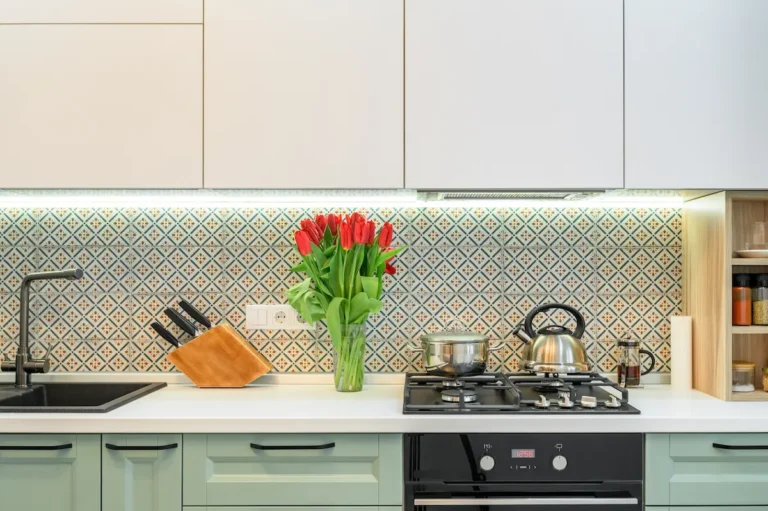
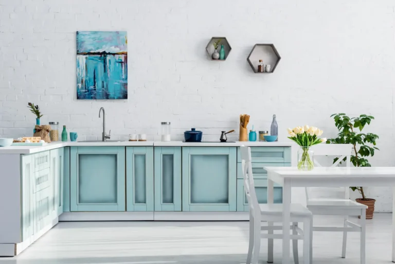
That Perfect Gray-Green Sweet Spot
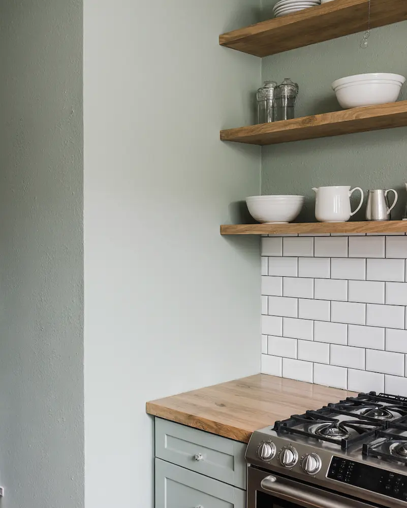
So here’s where I made my biggest mistake initially. I was terrified of gray because I thought it would make my kitchen feel cold and clinical. But then I discovered this magical middle ground – gray with just enough green to warm it up.
I stumbled onto this color combination by accident when I mixed the wrong paint samples. The result? This soft, sage-like tone that feels fresh but not overwhelming. It’s like the color equivalent of a deep breath. My kitchen faces north, so it doesn’t get tons of natural light, but this gray-green actually makes the space feel brighter and more alive.
The best part? It goes with literally everything. Stainless steel appliances, wooden shelves, white subway tiles – it all just works together effortlessly.
Cream (But Not the Boring Kind)
I used to think cream was just white’s less confident cousin. Boy, was I wrong. Real cream – the kind with just a whisper of warmth and maybe the tiniest hint of pink – is pure magic in a kitchen.
Last year, I helped my neighbor transform her builder-grade kitchen, and we went with this gorgeous creamy tone that reminded me of fresh butter. The transformation was insane. Her dark cabinets suddenly looked elegant instead of heavy, and her granite countertops went from “blah” to “beautiful.”
What I love about cream is how it changes throughout the day. In the morning light, it feels fresh and clean. By evening, it’s warm and inviting. It’s like having a mood ring for your walls.
Earthy Terracotta (My Personal Favorite)
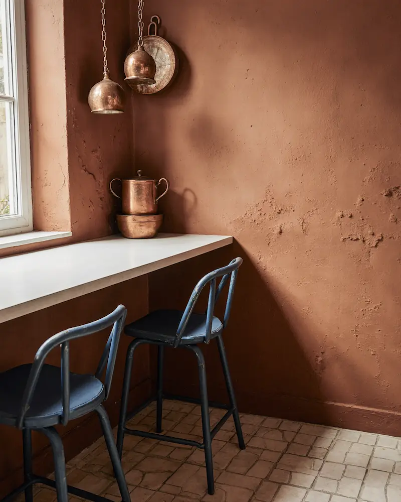
This is where I get excited because terracotta in kitchens is criminally underrated. I painted my breakfast nook this warm, clay-inspired orange-brown, and it instantly became everyone’s favorite spot in the house.
There’s something primal about terracotta that just works in a kitchen. Maybe it’s because humans have been cooking with clay for thousands of years, but it feels right in a way that’s hard to explain. I paired it with navy blue bar stools and copper pots, and suddenly my kitchen felt like it had personality.
The versatility shocked me too. You can go full bohemian with patterned tiles and plants, or keep it sleek with white countertops and modern fixtures. Either way, that earthy warmth makes everything feel more inviting.
Bold Turquoise (When You’re Ready to Commit)
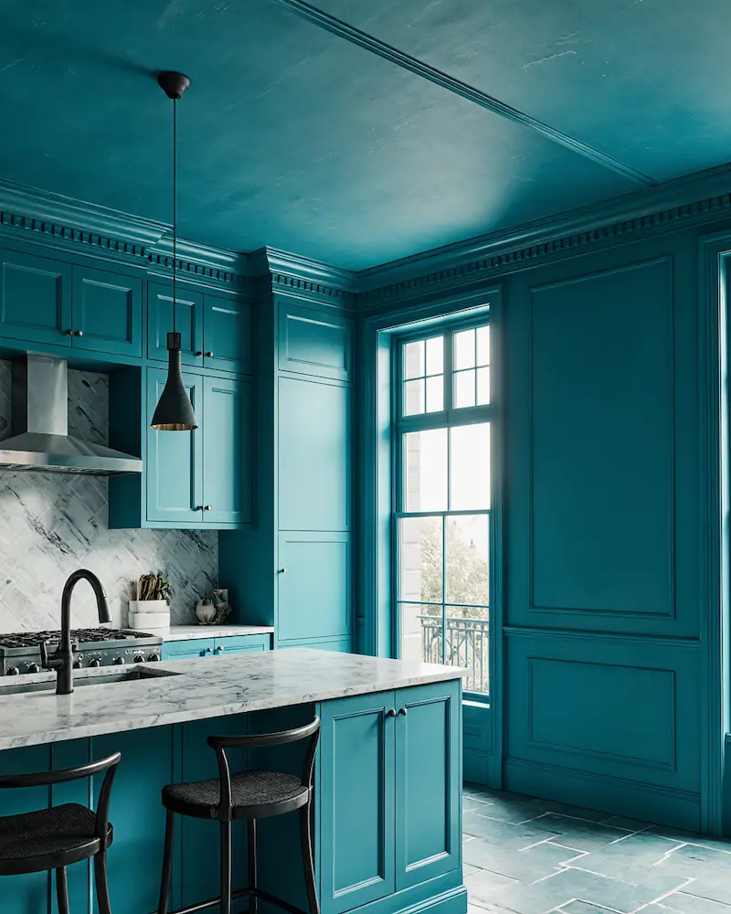
I won’t lie – turquoise scared me for years. It felt too bold, too risky. But after seeing what my sister did with it in her kitchen, I’m a convert.
She went all-in with this gorgeous blue-green and painted not just the walls but the island and even the ceiling. I thought it would be overwhelming, but it’s actually the opposite. The whole space feels cohesive and intentional, like she hired a fancy designer.
The trick, I’ve learned, is to really commit. Half-hearted turquoise looks like you’re trying too hard. Full-commitment turquoise looks like you know exactly what you’re doing, even if you’re figuring it out as you go.
Navy Blue (The Safe Choice That’s Actually Brilliant)
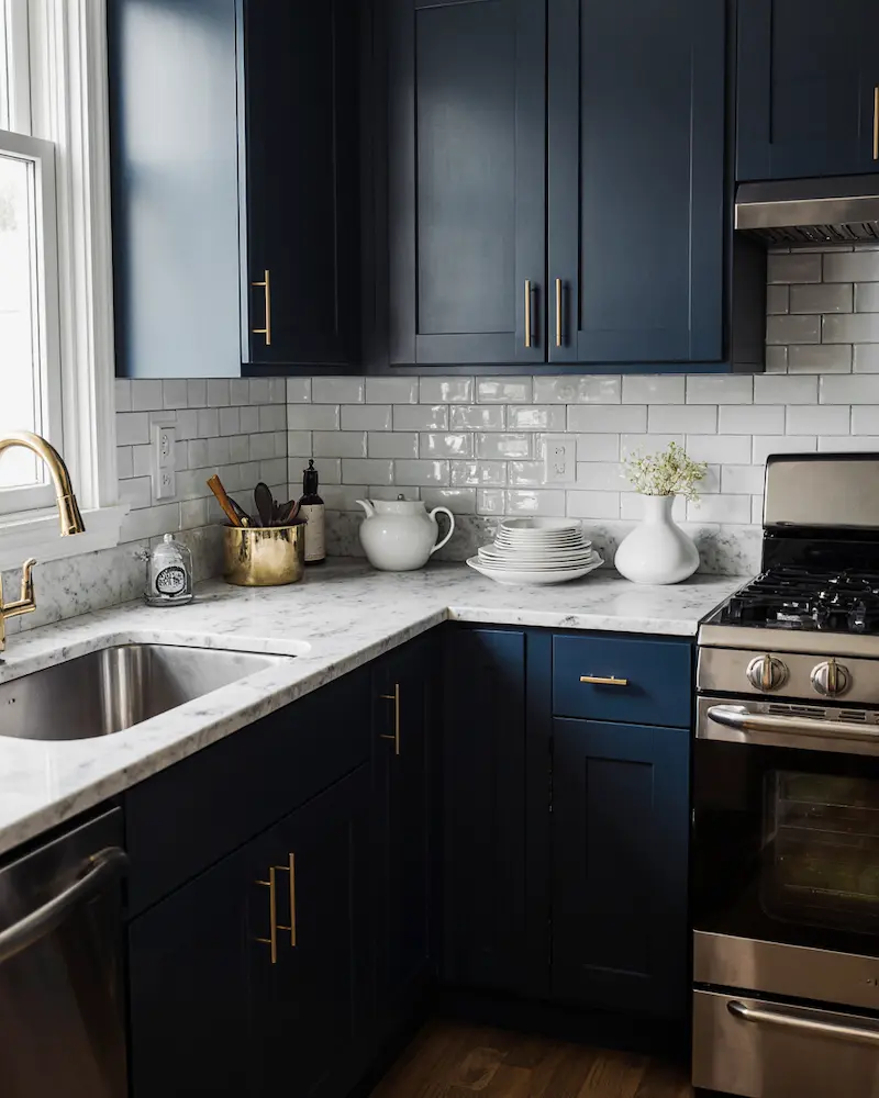
Navy was my compromise color when I couldn’t decide between black and blue, and it turned out to be the best decision I never meant to make.
What I love about navy in a kitchen is how sophisticated it feels without being pretentious. It’s bold enough to make a statement but classic enough that you won’t hate it in five years. I paired it with brass cabinet pulls and marble countertops, and it feels both timeless and current.
The other thing about navy? It makes everything else look more expensive. My basic white dishes suddenly looked like fancy dinnerware, and my stainless steel appliances seemed more intentional.
What I Wish I’d Known From the Start
Here’s the thing about kitchen wall colors – they’re not just background. They’re setting the mood for every meal, every morning coffee, every late-night snack. Don’t treat them like an afterthought.
Start with your wall color and build everything else around it. I know it sounds backwards, but trust me on this. When you find a color that makes you happy every time you walk into the room, the rest of the design decisions become so much easier.
And whatever you choose, go with something that makes you excited to cook, even if it’s just reheating leftovers. That’s when you know you’ve got it right.