Picture this: you’re standing in your kitchen at 6 AM, bleary-eyed and reaching for coffee, when suddenly you notice how the morning light catches those delicate botanical motifs behind your breakfast nook. Instead of feeling like you’re in just another sterile cooking space, you’re in a room that actually feels like you. That’s the magic of thoughtfully chosen kitchen wallpaper – it transforms your most hardworking room into a space that works just as hard at making you happy.
Here’s what I wish someone had told me years ago when I was staring at endless rows of subway tile: your kitchen doesn’t have to choose between function and personality. The right wallpaper can give you both, and contrary to what you might think, it’s one of the most practical updates you can make to create instant warmth and character.
Why Your Kitchen is Actually Begging for Wallpaper

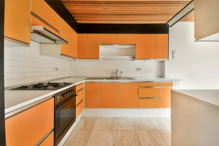
Let’s be honest – most kitchens suffer from what I call “surface overload.” Hard countertops, glossy cabinets, stainless appliances, ceramic backsplashes. All beautiful and necessary, but together they can make your space feel more like a showroom than a home. Wallpaper is your secret weapon for breaking up all that shine and creating visual breathing room.
The beauty of kitchen wallpaper lies in its versatility. Unlike a major renovation, you can completely shift the mood of your space in a weekend, and if you change your mind in a few years? It’s changeable. Compare that to retiling your entire backsplash, and suddenly wallpaper looks pretty genius.
Strategic Placement: Where Wallpaper Makes the Biggest Impact
The Breakfast Nook Sweet Spot

Here’s where I always start with clients: that cozy corner where you actually live in your kitchen. Whether it’s a built-in banquette or just a small table by the window, this area is perfect for wallpaper because it’s away from cooking splashes but gets plenty of daily appreciation.
I recently helped a client transform her bland morning routine by adding a charming lemon tree print behind her coffee station. Now she tells me that making her morning latte feels like a mini vacation to the Mediterranean. That’s the power of starting your day surrounded by something that makes you smile.
The Dining Zone Game-Changer

If you have an open-plan kitchen that flows into your dining area, wallpaper becomes your best friend for creating distinct zones without building walls. I love using wallpaper to define the dining portion – it instantly signals “this is where we gather and linger,” separate from the “this is where we prep and clean” energy of the working kitchen.
The trick here is choosing something that complements your cabinet colors while having enough personality to stand on its own. I’ve seen stunning results with deep jewel tones behind dining tables, especially when you pick up one of those colors in your bar stools or pendant lighting.
Above-the-Paneling Sophistication

One of my favorite designer secrets? If you’re worried about wallpaper’s durability in a kitchen but still want the impact, install it above painted wainscoting or board-and-batten paneling. You get all the visual interest at eye level where it counts most, while the lower portion stays protected and easily washable.
This approach works beautifully in both traditional and modern kitchens. For a contemporary twist, try geometric wallpaper above sleek horizontal paneling painted in a bold color. For classic charm, delicate florals above traditional beadboard never fails to enchant.
Pattern and Style: Finding Your Kitchen’s Personality
The Timeless Stripe Strategy

When clients feel overwhelmed by pattern choices, I always circle back to stripes. They’re like the perfect white button-down of wallpaper – classic, versatile, and surprisingly sophisticated when done right. The secret is in the scale and spacing.
Narrow pinstripes create subtle texture that reads almost like a solid from a distance, perfect if you want wallpaper’s impact without overwhelming a small space. Wide, bold stripes make a statement and can actually make your ceiling appear taller – a great trick for galley kitchens or cozy breakfast areas.
This fall, I’m seeing gorgeous results with warm-toned stripes in sage and cream, or navy and soft gray combinations that feel both current and timeless.
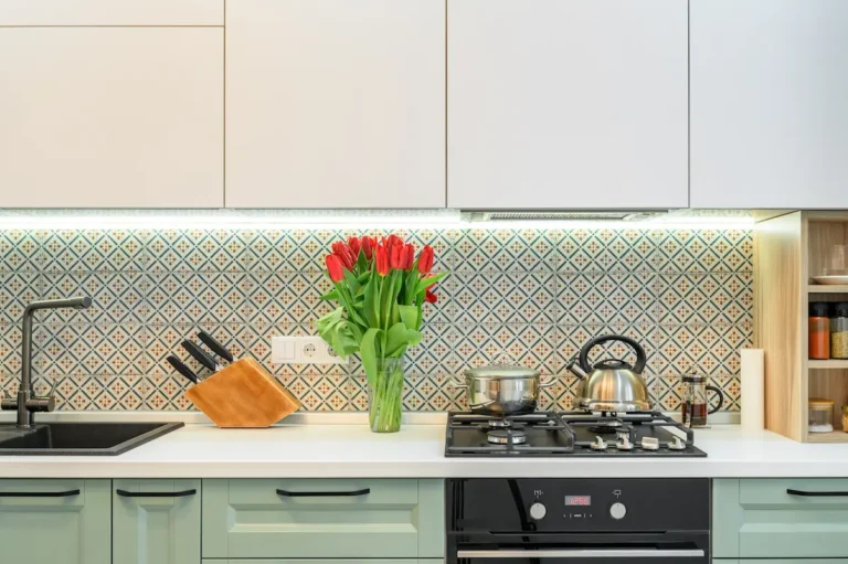
Botanical Bliss: When Nature Comes to the Kitchen

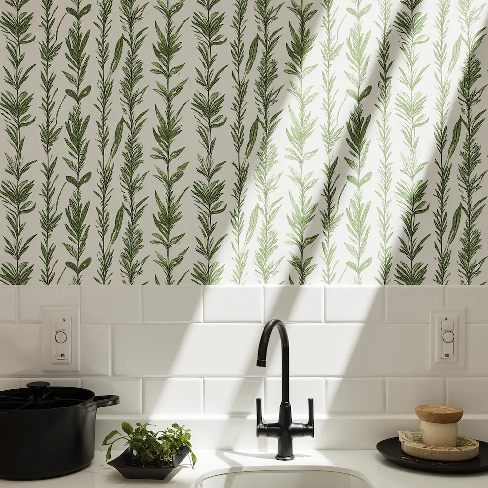
There’s something deeply satisfying about bringing garden motifs into the space where you prepare fresh meals. Botanical wallpapers have evolved far beyond grandma’s cabbage roses – today’s options range from modern line-drawn herbs to sophisticated tropical leaves that would make any design magazine swoon.
For herb gardens on paper, look for designs featuring rosemary, thyme, or olive branches – they feel authentic to kitchen life without being too literal. If you’re drawn to larger botanicals, consider oversized monstera leaves or eucalyptus branches that create drama without busy-ness.
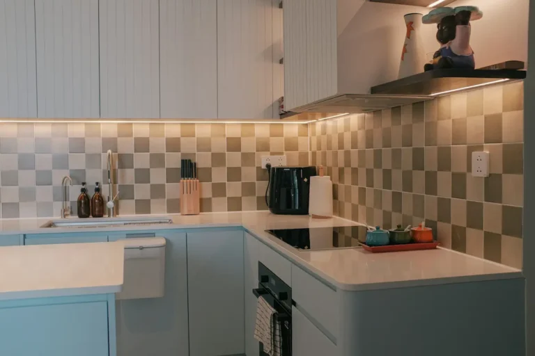
The Unexpected Geometric Moment
Here’s where you can have some real fun: geometric patterns in kitchens create such striking focal points, especially when you contrast them with more traditional elements. Picture a sophisticated hexagon pattern behind a farmhouse-style dining table, or Art Deco-inspired scales complementing sleek modern cabinetry.
The key is choosing geometrics with enough breathing room in the pattern – too dense, and your space will feel chaotic rather than sophisticated.
Color Psychology: Setting the Right Mood
Warm Neutrals for Year-Round Comfort

I always tell clients that your kitchen wallpaper color should make you want to linger over morning coffee and evening wine equally. Warm neutrals like mushroom gray, soft sage, or creamy beige with subtle pattern work beautifully because they provide personality without competing with your food or natural light changes throughout the day.
These colors also photograph beautifully – important if you love sharing your cooking adventures on social media or hosting dinner parties where everyone ends up in the kitchen anyway.
Seasonal Color Considerations

Spring calls for fresh, optimistic colors: think soft lavender with white accents, or sage green with delicate white florals. Summer invites slightly more saturated tones – perhaps a cheerful coral geometric or coastal blue botanical.
As we move into fall, I’m gravitating toward wallpapers in warm terracotta, deep forest green, or rich navy that create cozy gathering spaces perfect for soup season and holiday entertaining. Winter months benefit from deeper, more dramatic tones that feel sophisticated and warm during those long dark evenings.
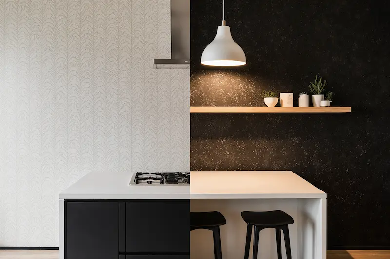
The Bold Choice: When Dark Makes Sense

Don’t automatically shy away from darker wallpapers in kitchens. When done thoughtfully, deep colors create incredibly sophisticated and intimate dining spaces. A charcoal botanical print or midnight blue geometric can make your kitchen feel like an elegant restaurant – perfect for evening entertaining.
The secret is ensuring you have enough light sources: under-cabinet lighting, pendant fixtures, and natural light during the day. Dark wallpaper actually hides minor imperfections and daily wear better than light colors, making it surprisingly practical.
Practical Considerations That Actually Matter
Budget-Friendly Approaches That Look Expensive

You don’t need to paper every wall to achieve significant impact. Some of my most successful kitchen transformations used wallpaper strategically: just the breakfast nook, just above existing backsplash, or just the dining area of an open concept space.
Peel-and-stick options have come incredibly far in recent years. While they might not have the longevity of traditional wallpaper, they’re perfect for renters or anyone wanting to test-drive a bold pattern before committing fully.
Another budget trick: use wallpaper inside glass-front cabinet backs for instant pattern without major commitment. It’s removable, protected from kitchen moisture, and creates beautiful layered visual interest.
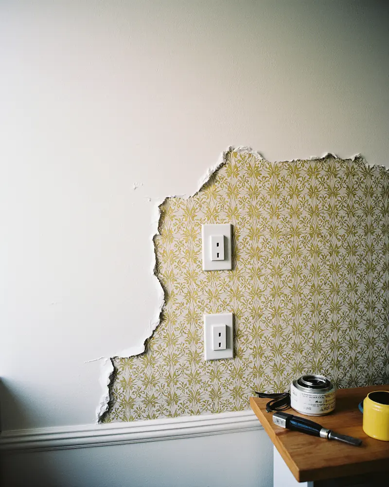
Moisture and Durability: The Real Talk
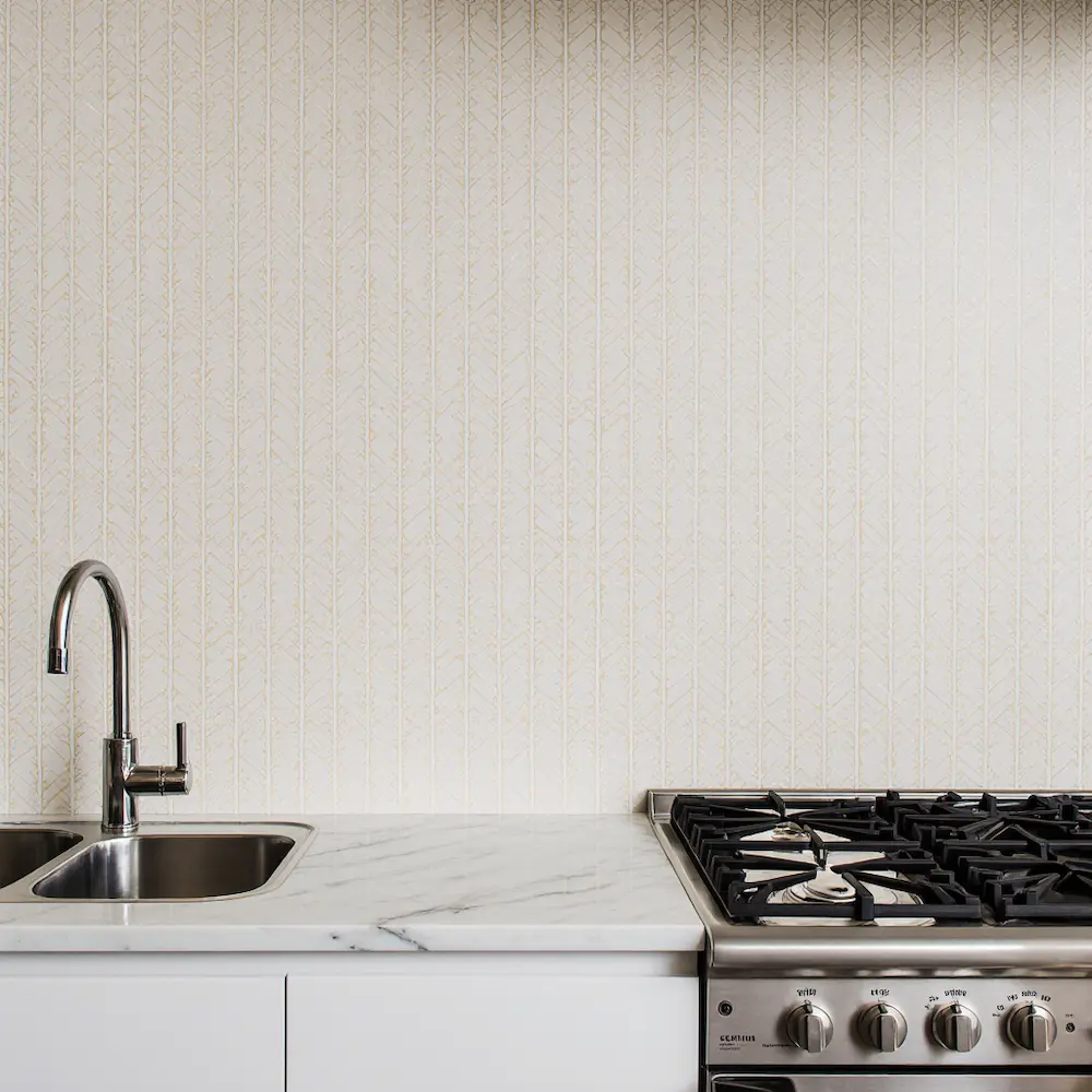
Let’s address the elephant in the room: kitchens get steamy, splashy, and messy. The good news is that today’s vinyl-coated wallpapers are remarkably durable and washable. Look for papers specifically labeled as “scrubbable” or “washable” – they can handle gentle cleaning with a damp cloth.
Avoid placing wallpaper directly behind your cooktop or sink, where grease and water splashes are daily occurrences. Instead, use these high-impact areas for tile or painted surfaces, and save wallpaper for zones that get appreciated but not abused.
Installation Tips for Success
If you’re tackling installation yourself, start with the most visible wall and work toward less prominent areas where slight pattern mismatches won’t be noticeable. Kitchen walls often have lots of outlets, switches, and interruptions, so having a sharp craft knife and patience is essential.
For rooms with lots of angles and obstacles, consider hiring a professional for the installation but choosing the wallpaper yourself – it’s often worth the investment for a polished result.
Current Trends Worth Considering
The New Maximalism: Pattern Layering

The minimalist kitchen trend is giving way to something much more personal and collected-feeling. I’m seeing beautiful results when clients layer their wallpaper pattern with coordinating textiles: think botanical wallpaper paired with striped cafe curtains, or geometric wallpaper complemented by textured placemats in coordinating colors.
This approach makes your kitchen feel curated rather than decorated, like it evolved over time rather than being designed all at once.
Vintage-Inspired but Modern-Scaled

Archive prints are having a major moment, but today’s versions are often rescaled for contemporary living. Look for traditional motifs like damask or toile, but in larger, more relaxed scales that feel fresh rather than fussy.
Sustainable and Natural Materials

As we become more conscious about our environmental impact, wallpapers made from natural fibers like grasscloth or cork are gaining popularity. These textural options add incredible warmth and sophistication while being environmentally responsible choices.
Making It Work in Small Spaces
The Vertical Trick for Galley Kitchens

In narrow kitchens, vertical stripe wallpaper on the short end walls can make the space feel wider and more balanced. It’s a visual trick that actually works, especially when you choose stripes in colors that complement your cabinet finish.
Scale Matters in Tight Quarters
Small kitchens can absolutely handle pattern, but scale becomes crucial. Generally, smaller, more frequent patterns work better than large, bold motifs that might feel overwhelming in a compact space. Think delicate herb prints rather than oversized tropical leaves.
Seasonal Styling Around Your Wallpaper
Spring and Summer Lightness

As warmer months approach, style your wallpapered kitchen with lighter accessories: white ceramics, fresh flowers in simple vases, and natural textures like woven placemats. Let your wallpaper be the steady backdrop while your accessories bring seasonal freshness.
Fall and Winter Coziness

When temperatures drop, layer in warmer elements: copper accessories, deeper-toned pottery, and textural elements like woven baskets or wooden cutting boards. Your wallpaper becomes the foundation for creating that hygge feeling everyone craves during cozy season.
The Finishing Touch: Styling Your Wallpapered Kitchen
Creating Cohesion Without Matching

The goal isn’t to match everything to your wallpaper, but to create a conversation between elements. If your wallpaper features soft blues, echo that color in a ceramic vase or stack of cookbooks. If it has gold accents, bring in brass cabinet hardware or copper pots.
Lighting Considerations
Wallpaper can dramatically change how light moves through your space. Lighter patterns reflect more light, making spaces feel airier, while darker papers absorb light, creating more intimate atmospheres. Plan your lighting accordingly – under-cabinet strips, pendant fixtures, and table lamps all help balance the mood.
Your Kitchen’s Character Journey
Choosing wallpaper for your kitchen isn’t just about following trends – it’s about creating a space that reflects how you actually live. Do you host elaborate dinner parties or prefer intimate family meals? Are you someone who finds energy in bold patterns or peace in subtle textures? Your wallpaper choice should support your lifestyle, not fight against it.
The most successful kitchen wallpaper installations I’ve witnessed are the ones where clients chose something that genuinely excited them, regardless of whether it was “safe” or “trendy.” When you love waking up in your space, when guests linger longer over coffee, when cooking dinner feels less like a chore and more like a pleasure – that’s when you know you’ve made the right choice.
Your kitchen works hard for you every single day. Isn’t it time it worked a little harder at making you happy, too? Whether you choose delicate botanicals or bold geometrics, subtle stripes or dramatic florals, the right wallpaper will transform your hardworking kitchen into a space that nurtures both your practical needs and your creative spirit.
Remember, the best wallpaper choice is the one that makes you smile every time you walk into the room – and trust me, after helping dozens of clients through this process, that daily dose of joy is worth every consideration we’ve discussed.