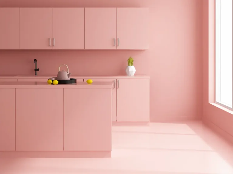
Look, I’ve been there – you walk into a kitchen and something just feels… off. Usually, it’s because the colors are fighting each other, and honestly? Once you notice clashing colors, you can’t unsee them. They become the only thing you can focus on, no matter how beautiful everything else is. But here’s the thing – sticking to just one color feels kind of boring and safe, right? So the trick is nailing those color combinations that actually work together. And where’s the best place to play with multiple colors? Your cabinets.
Now, I’m not gonna lie – figuring out the perfect kitchen cabinet color combinations can feel overwhelming. That’s why I love leaning on design experts who’ve already done the heavy lifting for us. Whether you’re going for bold and brilliant or cozy and tranquil, I’ve got some combinations that actually work (and I mean really work).
The color combinations that always work on kitchen cabinets
Adding color to your kitchen is one of those things that sounds simple but… well, you know how it goes. Using tried-and-true color combinations on your cabinetry is honestly like having a cheat code for a stylish kitchen. Why spend hours staring at color charts when design pros have already figured out what works?
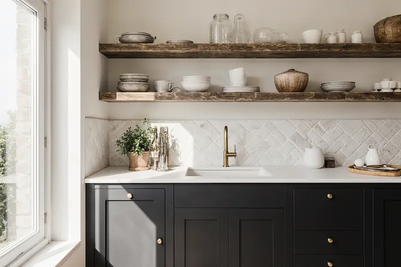
1. Black and white
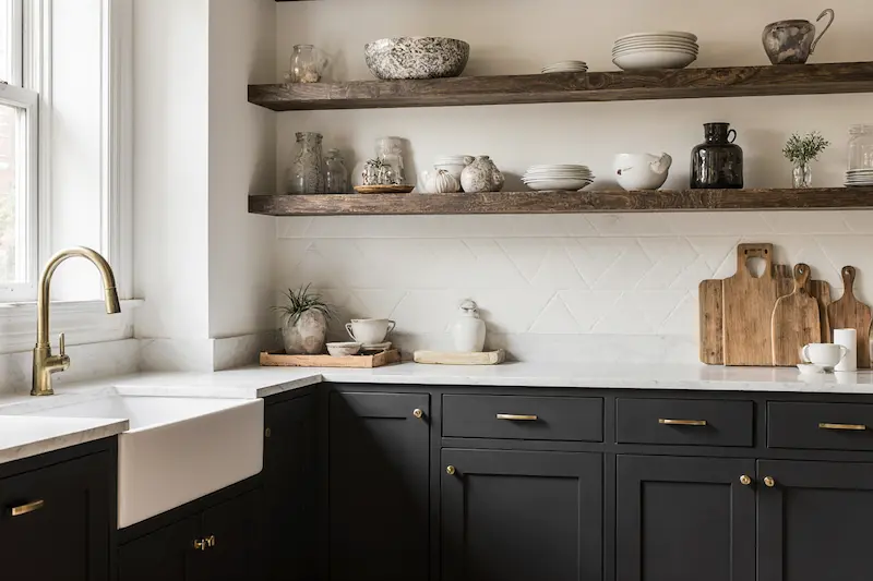
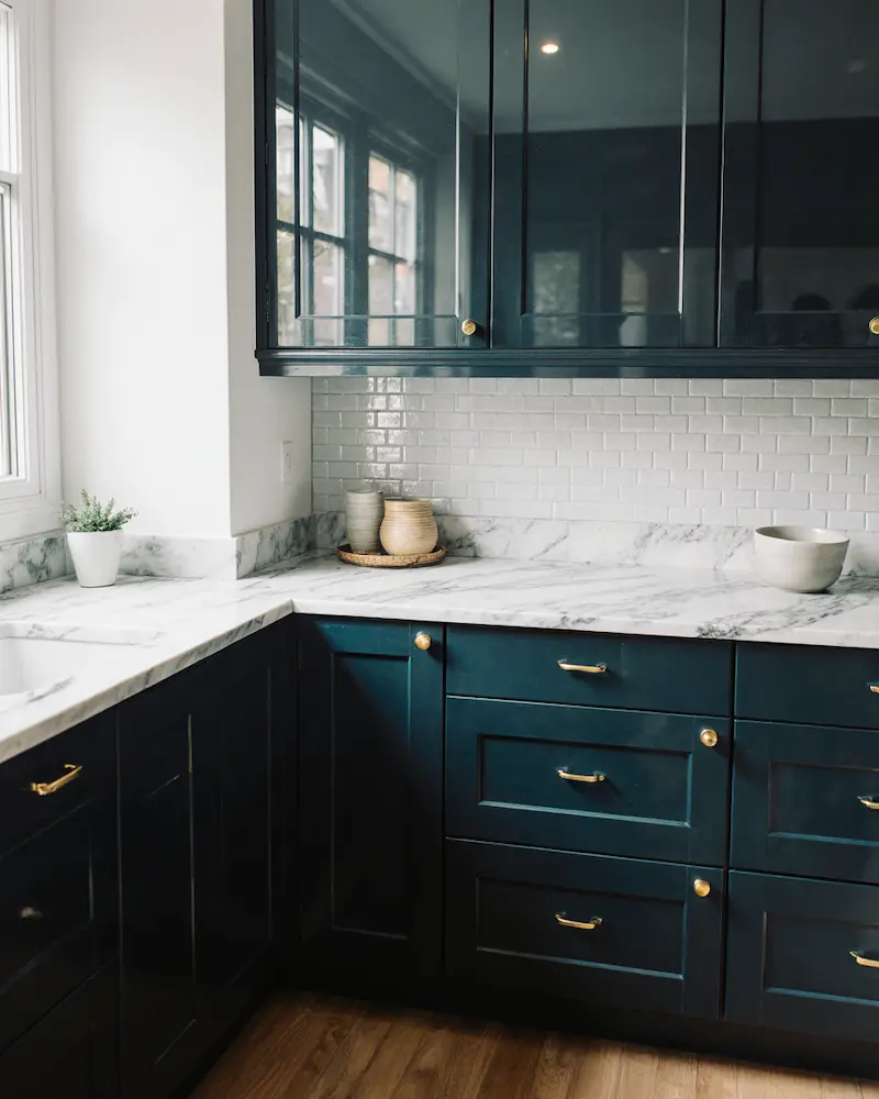
It’s a classic for a reason, right? Black and white kitchen cabinets just work together – there’s something so sleek and timeless about this combo. What I love is how black on the bottom cabinets gives the kitchen this grounding, dramatic feel, while white wall cabinets lift your eye upward and make the space feel so much bigger.
‘Don’t be afraid to go dark on your cabinetry, especially when paired with a good mid-neutral,’ says Patrick O’Donnell, brand ambassador at Farrow & Ball. ‘Dark kitchens are striking yet timeless and are especially good at giving presence to a small room, even more so if your cabinets are the lower units as this will provide ‘structure’ to your room. Think something elegant like our blackest blue Railings.’
Want to make it feel less harsh? I’ve found that smokey greys or blue-blacks paired with off-whites like eggshell and ivory give you that same contrast but with more warmth. And here’s what really makes it work – add plenty of texture and rustic elements to soften things up.
2. Dark green and light green
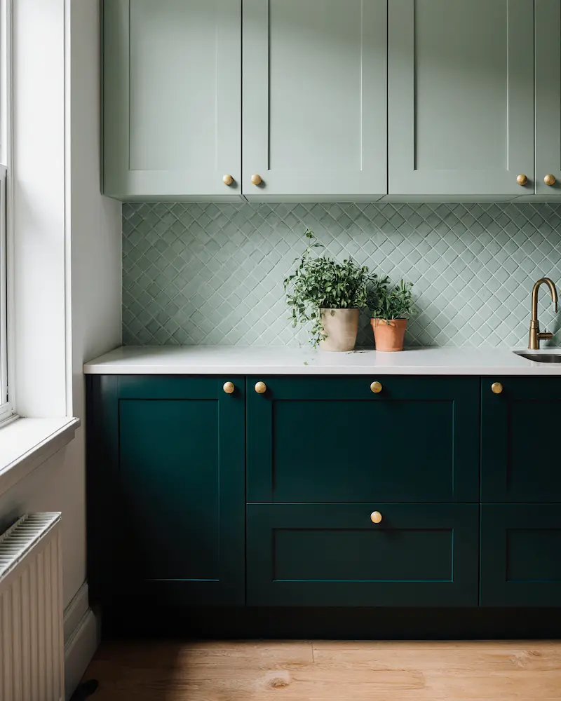
Okay, so you know what’s better than a green kitchen? A green kitchen with multiple shades of green. I know it sounds like it might be too much, but trust me – the tonal difference actually adds this amazing dimension that brings your cabinets to life. You can have fun with this one too, whether it’s forest green with sage, khaki with pistachio, or moss with mint.
‘For a vibrant, contemporary, tonal scheme, combine complementary green shades ‘Harley Green’ and ‘Tea with Florence’ to create a subtle contrast,’ advises Ruth Mottershead, creative director at Little Greene.
And here’s something I learned that surprised me – green is actually the easiest color on your eyes. If you’ve been squinting at cookbooks or feeling tired around dinner time, a double dose of green might leave you feeling more energized and creative in your kitchen.
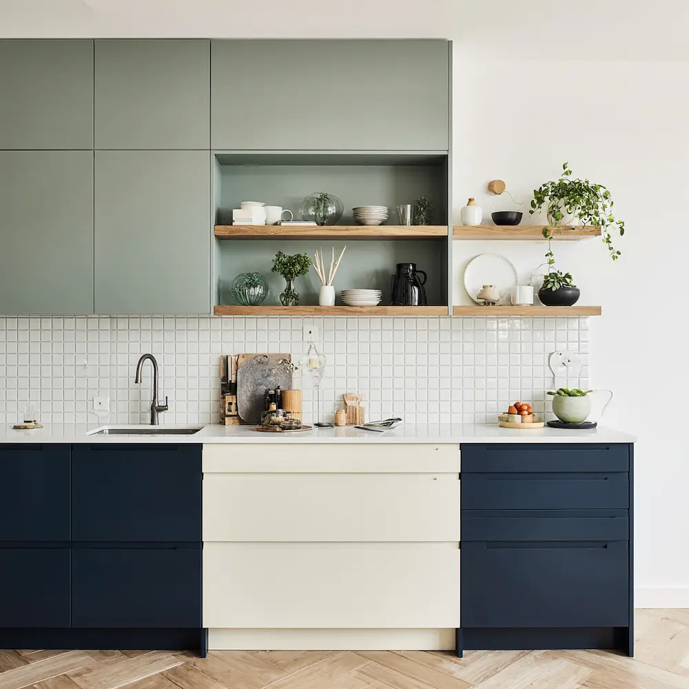
3. White and navy
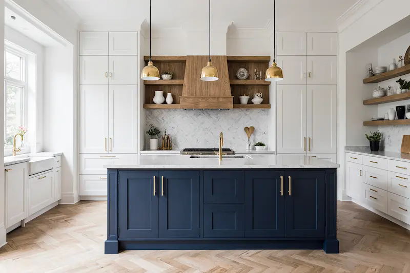
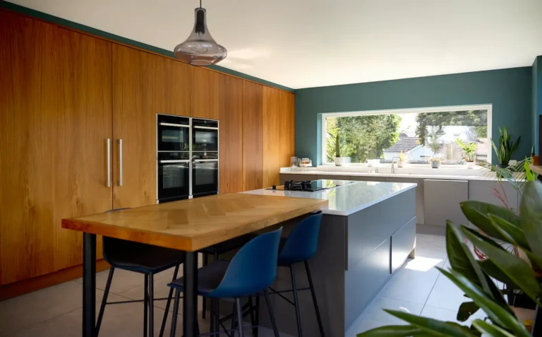
White and navy is one of those combinations that just feels right. It’s coastal without being cutesy, classic without being boring. These two shades create this crisp, refined style that honestly never goes out of style.
‘In this kitchen, we did a classic white with a warm wood along with a beautiful deep blue for the island. It feels cohesive, classic and fresh,’ explains Allison Ruda, founder of Allison Ruda Interior Design. ‘This is a great way to have a white kitchen without it feeling sterile or boring. The wood cabinets on the lower add so much warmth and charm and the beautiful blue cabinetry within the island adds some character and grounding.’
4. Blue-gray and gray
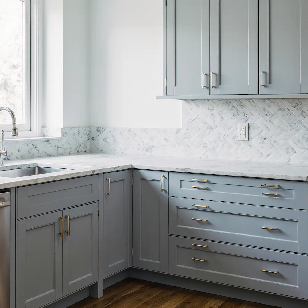
Blue-gray and gray cabinets are honestly a match made in heaven. The pairing is subtle and sophisticated, and it proves that cool colors can still feel welcoming – something I didn’t believe until I saw it done right.
What I love about this combination is how it adds dimension to your kitchen in unexpected ways. You get these beautiful shadows and depth that you wouldn’t expect from gray. The two shades give you this organic, grounded look that brings life to each row of cabinets.
Margaret Donaldson, interior designer and founder of MDI Luxury Design, uses Benjamin Moore’s Sterling 1591 on her perimeter cabinets and Adagio 1593 on the island. ‘Sterling is a light, crisp gray which is bright and fresh, while Adagio is a richer blue-gray which adds depth and interest as an accent color,’ she says. ‘This is a cool-toned palette with a nice balance of light for the perimeter and depth for the island.’
5. Green and blue
I’ll be honest – blue and green used to be one of those combinations that made me nervous. They’re analogous colors, and for the longest time, we avoided pairing colors that were too similar. But trends are shifting, and I’m actually loving analogous schemes now. Blues and greens are probably the most calming and livable of them all.
As designer Danielle Novy says, ‘Saturated greens and teals are pretty versatile colors for kitchen cabinets.’ And she’s right – this combo works with so many different kitchen styles.
The result? Your kitchen gets these electric jolts of color that somehow still feel grounded. Look for blue shades like azure, cobalt, and cerulean – the more depth, the better. Same thing with green shades – anything in a rich emerald or bottle green will give you that enriched, uplifting feeling you’re after.
‘Deep greens and navy will perfectly contrast against cool marble surfaces. Consider a higher finish on cabinetry, like semi-gloss or high-gloss, to bring reflection and dimension to slightly darker space,’ suggests Helen Shaw, director of marketing at Benjamin Moore.
The bottom line
Combining kitchen cabinets can feel tricky at first, but honestly? It makes for such a more fulfilling, enriched kitchen space. Whether you go with classic arrangements or bold compositions, there’s definitely a color pairing that’ll work for your space and style. The key is just picking one that speaks to you and going for it.